Customer Onboarding Experience: Make a Great First Impression
23 February 2017By Nora Blanco
There is no second chance to make a great first impression… it’s an old phrase but very relevant when designing an Onboarding process. The opportunity to seduce the user of a digital product –mobile app or website– when she interacts with it for the first time is often wasted by those responsible for the product.
The term Onboarding in the digital industry refers to the process –designed or not– people go through when using a product for the first time. It could be compared with a first date; the attention to details on our part and to the reactions of the other person are important factors to consider.
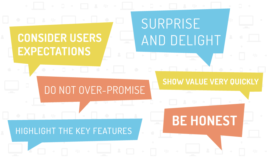
It is important to show value very quickly and care for the user expectations in the initial moments, especially before asking her to register.
The first time a person uses a product, she may have a clear idea of the product and its benefits but it is also possible that her knowledge is shallow and she only downloaded our app or visited our site because of a recommendation, a click on an ad, or just landed from a search engine result. In any case, she expects her needs to be fulfilled, and –knowing there’s no such thing as a silver bullet– it is important to be clear in our messages and never over-promise. Avoid instant and effortless solutions. It is better to surprise and delight with ease of use and not disappoint by saying that all can be done in a few seconds, in two steps, or in one click… when reality will show that more than that will be needed, like watching a tutorial video or even reading some instructions.
If your product is not totally bug-free, it is better to be honest. Show the product is still in Beta version and offer a simple way to send feedback if any issues appear. That way, the user will be more tolerant when faced with possible obstacles and will be more open to sending constructive feedback. Having said that, do not overdo your Beta version period (although Google kept Gmail in Beta for 5 years!).
The registration/sign-up process is key to a product’s success in the initial phase. This can be the difference between a hit User Journey or a failure.
It is very important not to waste the development and interaction design efforts to make the product work great; all that can be counterproductive if the registration process is perceived as an obstacle, cumbersome, inefficient and of little value or if the amount of information required is excessive and generates suspicions. The way to avoid this is by designing a sign-up user experience that’s easy, transparent and simple.
To design a registration UX, that is both simple and efficient, you must require only the minimum amount of data needed for the product to work.
The Marketing team, generally the most interested in knowing the client, will have a chance to gather more information later, once the users are engaged with the product and in a user retention phase. In each case, it is convenient to explain why certain data is requested, for example if you need to send a verification code to complete a transaction, say that’s why you need the mobile number. Avoid unnecessary steps, like the Captcha validation for a new and little known product. The amount of spam in the early stages is usually manageable and you can always add it later when it’s really essential.
It could be said there are two ways to design an Onboarding UX: the first is with a walkthrough of the product, showing and highlighting the key features. In general, clients think of this approach when talking of User Onboarding design, as it is the most popular method. The main advantage of this style is that any features that may be new or different than the way people are used to can be addressed right off the bat.
The second style is to invite the user to do a task. This is very common in apps based on user-generated content or needing communities. The advantage of this method is that the user is engaged and really using the product immediately.
You will have to decide what is the best approach is for each case, at Giro54 we tend to use an ongoing Customer Onboarding UX combining both styles: luring users to perform tasks mingled with tips for more complex operations.
In all cases, we think it is key to let the user know if any part of the process will be lengthy. Sometimes, the set-up in complex applications require several steps; if that is the case, it is better to inform the user of how many steps are required and show there’s a light at the end of the tunnel.