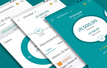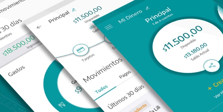

A Fintech start-up with social conscience, to realize the promise of greater community well-being and development
Services:
Industries:
Partnering in Digital Transformation, one client at a time
The joy from buying her first car was still at its peak when the complexities of auto insurance fell on Marina like a hail storm. She had estimated maintenance, gas, and parking expenses to make sure that her economy would remain stable, however, when the time came to choose the right insurance policy, all control wobbled. The overwhelming number of coverage types and options, mostly indistinguishable from each other, made her anxious. The process was complicated and full of legal jargon, and she feared having to face an accident without the proper coverage. On top of it all, extras came into play: hail, locks, windshields, partial theft and damages… in the best of cases, the descriptions were nothing more than a list of hard-to-understand items.
While analyzing the needs of insurance clients, we discovered that even those with years of experience felt uncertain when having to choose the right coverage. Whether it is home, life, or auto insurance, emotional aspects always come into play.
These factors were a big driver for the UX redesign of San Cristobal’s corporate website. The new user experience was conceived as part of the digital transformation that the company is going through, fully aware of its need to adapt to the digital economy, while maintaining the values that, after 80 years of history, have made San Cristobal the highest net worth insurer in Argentina.
User-centered design calls for integrating real users in the design process, in order to empathize with them, and to better understand their needs and emotions. To do this, we interviewed not only clients, but also San Cristobal’s agents, those who maintain the relationship with the insured day by day.
User research findings in hand, we set to redefine the content organization, the navigation and the information design to present San Cristobal’s coverage options in a clear and didactic way. We optimized the navigation paths so that the most wanted features are always at hand and require the least amount of clicks.


At Giro54 we analyze how each project integrates into the Customer Journey, considering all touchpoints between the client and the company to create a seamless experience across channels.
We implemented a “mobile-first” strategy so that those who use smartphones to visit the site would quickly find the most required content: obtain a coverage certificate, request mechanical assistance, report a claim and contact the different customer service channels.
For the Marketing team, one of the main goals of the project was to build a website that content editors could manage and update without needing to involve a designer or programmer.
Success lies in changing the way traditional companies relate to their customers. Digital transformation does not mean moving away from users but approaching them in a way that matches their needs and goals, being digitally omnipresent, and offering contact alternatives. To do this, we integrated all of the communication channels into the site: insurance agents, mobile applications, and phone customer service to offer a consistent experience at each touchpoint of the Customer Journey.
Giro54’s team was very committed to the project. Their willingness to respond to our inquiries, their availability and their commitment to deliver according to the planned dates and timeline was remarkable throughout the project.
Florencia Ferramondo - Project Manager, San Cristobal Seguros
Would you like to know more about our projects and services?
Contact us