

Three weeks of work enable 15% increase in conversions
Services:
Industries:
The new user experience, a reflection of the digital transformation at Interturis.
Interturis, one of the travel companies with the most branches in Argentina, posed a tempting challenge: to “blow up” the previous website and relaunch it with a user experience supported by a new strategy to go along with the company’s digital transformation.
We picked up the gauntlet and rolled up our sleeves with the technology, product and communications teams. The first step was a total immersion to understand all the players that make up the Interturis ecosystem.
Through interviews we identified the main actors involved in this transformation: the employees at the branches, who for years built relationships directly with the customers; the clients, used to interacting face to face with their advisors; the mother corporation (the OSDE Group) and the digital team.
One of the biggest challenges of Digital Transformation is to break away from the “status quo” that holds back every organization with years of existence and trajectory. Facilitating change by transforming personal resistances into adaptation and positive individual impact was one of the central axes of the project.

We defined 4 strategic pillars on which to support the change at Interturis:
1. Create an online / offline synergy, supported by its extensive experience and current offline structure by integrating branch employees.
2. Maximize its travel knowledge, its closeness and personalized contact with customers.
3. Extend the relationship with customers via an end-to-end, multi-channel support.
4. Integrate passive personalization in its digital channels.
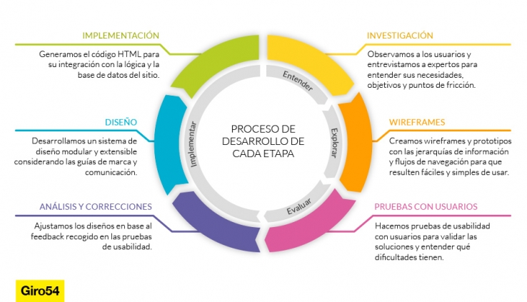
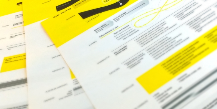
The project was developed in phases, with agile methodologies and incremental releases. In each stage, we repeated the cycle: Understand (learning from the experts and empathizing with the users); Explore (generating and prototyping new ideas); Evaluate (testing ideas with real users) and Implement (bringing solutions to reality). This process allowed us to continue learning so that each successive launch took advantage of the definitions of the previous ones.

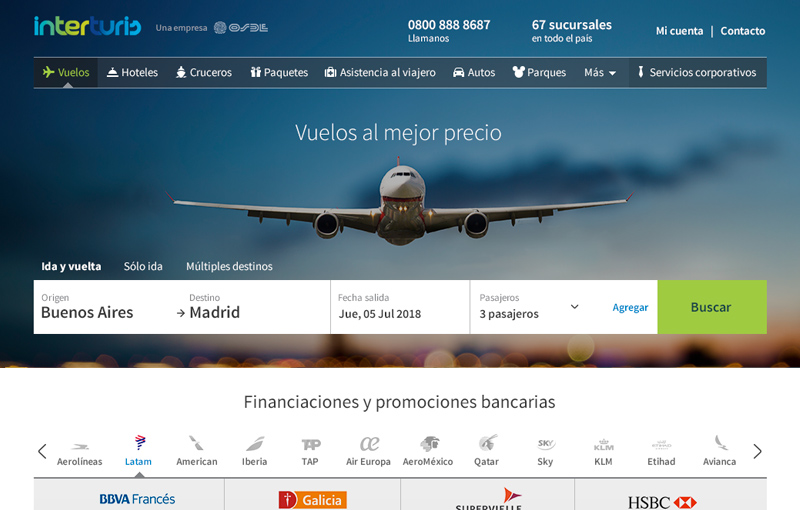
The first stage took on the Front Page and the Flights section. We focused on optimizing the experience to reduce the loss of customers along the purchase funnel (drop off rate) and on generating the DNA of a new UX that can be applied to the other sections: Hotels, Cruises, Packages, Travelers Assistance, Car Rentals, Theme Parks, Corporate Services and Fifteenth Birthday Trips (“Quinceañeras” in Spanish).
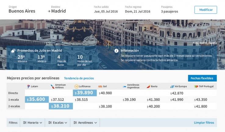
Some of the changes made to materialize the strategy included: adding the 0-800 phone number and branch search in the header of all screens to reinforce the physical presence; offering useful information (such as visa requirements, average temperatures and rainy days) at the intended destination to anticipate the travelers’ needs.
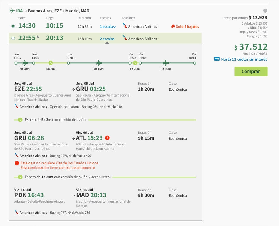

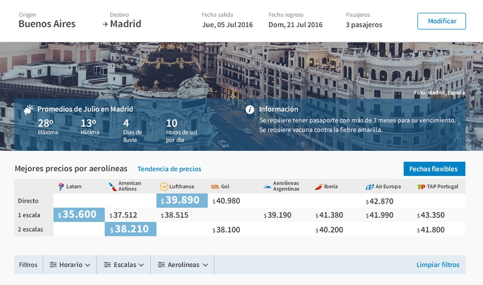
We developed a design system adaptable to multiple devices, from desktop computers to smartphones, using Responsive Design. This system presents the trip data (which includes many levels of information) in a simple and easy to understand way. An example: the duration of flight legs and layovers are presented in a proportional way so that the understanding and assimilation of the flight’s information occurs at a glance. In this way, a 4-hour flight is shown in a size 2 times larger than 2-hour layover.
We also redefined the data-input forms, especially those of the payment process (check-out) and the display and selection of the payment method. In Argentina, the travel industry and commerce in general are highly dependent on financing purchases in installments and discounts offered by banks and credit cards. This means that the price of each product can change according to the combination of credit card and issuing bank that the traveler has. The variety of banks, cards and promotions generates innumerable combinations that are complex and difficult to absorb for users. The solution delivered a simple and understandable payment experience, focused on building transparency and trust by letting the traveler know the exact price she will pay, including charges, taxes and fees.

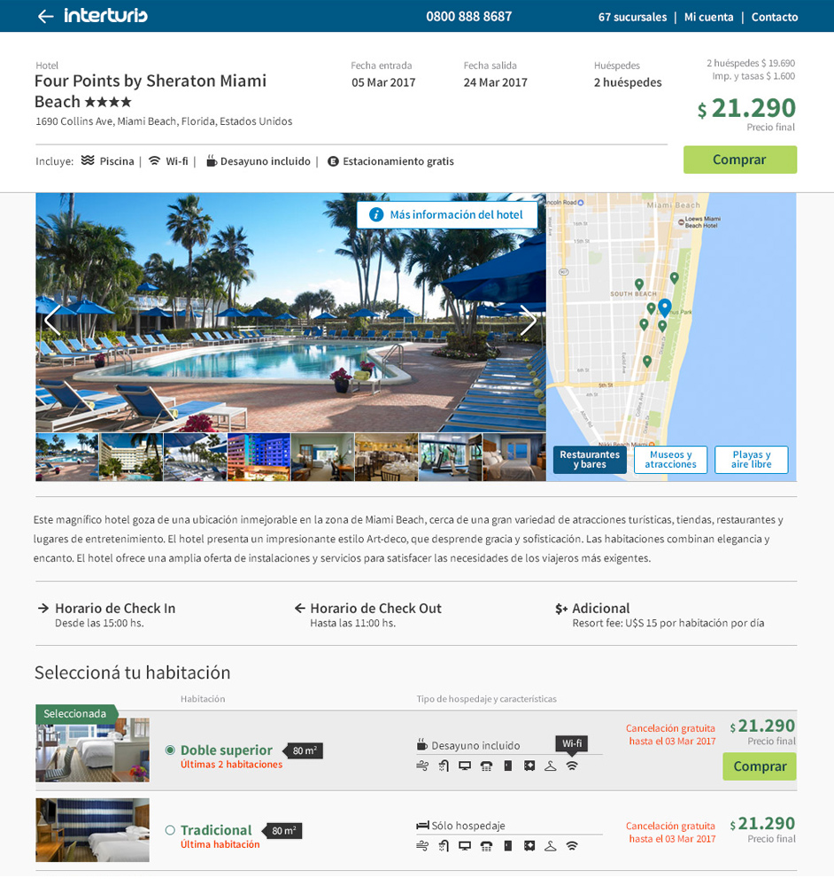
In the following stages we redesigned the remaining sections of the site, always with the premise of complying with the 4 strategic pillars. For Hotels, for example, we featured room photos and the location on the map because they are the 2 aspects most mentioned by travelers –together with the price and category– to choose the hotel.
The Travel Insurance section presented a special challenge because it is a complex product that involves technical jargon, and a large number of coverage options and restrictions that vary according to the passenger’s age, the trip’s duration and destination and the activities to be done. In the usability tests with real users we evaluated several options with interactive prototypes, which allowed us to find the preferred solution for travelers, with the right balance between the amount of information and the simplicity of the presentation.

Using a methodology focused on the users’ needs, we relaunched a product that puts the traveler in the center, and supports her throughout the journey from early exploration until the trip’s end. At all times, keeping in touch with the company’s traditional personalized treatment, and drawing on transparency and know-how as the main elements to ensure customer trust and security.
Would you like to know more about our projects and services?
Contact us Three weeks of work enable 15% increase in conversions
Discovering the customer journey for purchasing bathroom and kitchen faucets, offline and online.
eCementos, web portal for customers and sales force for Cementos Avellaneda (Argentina) and Cementos Artigas (Uruguay).
Licencia Creative Commons - Atribución – No Comercial – Sin Obra Derivada 4.0 Internacional