

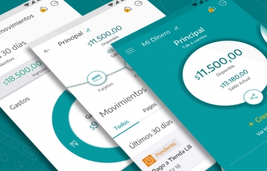
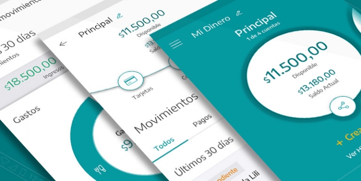
A Fintech start-up with social conscience, to realize the promise of greater community well-being and development
Services:
Three weeks of work enable 15% increase in conversions
It’s a spring weekend, one of those that invite dreaming about holidays. Mark and his girlfriend Paula put the coffee aside and take their tablet. They are determined to buy the flight tickets that will take them to the carnival in Rio de Janeiro next February. They compare options, prices and stopovers and finally settle on the flight that best suits their preferences. It’s time to pay. The form is long, and they carefully fill in their personal and credit card details. They click on the “Buy” button… and nothing happens. They press the button again and again. Nothing. They don’t understand what is happening, nothing seems wrong. The page simply does not work. Frustrated after several tries, they leave the site.


Usability problems are responsible for thousands of dollars in lost sales for e-commerce sites. They are an enemy that hurts companies silently, affecting not only the business but also the company’s credibility and brand loyalty.
In cases like Mark and Paula’s, the only trace of their frustration will be a small increase in the abandonment rate of the site’s purchase process.
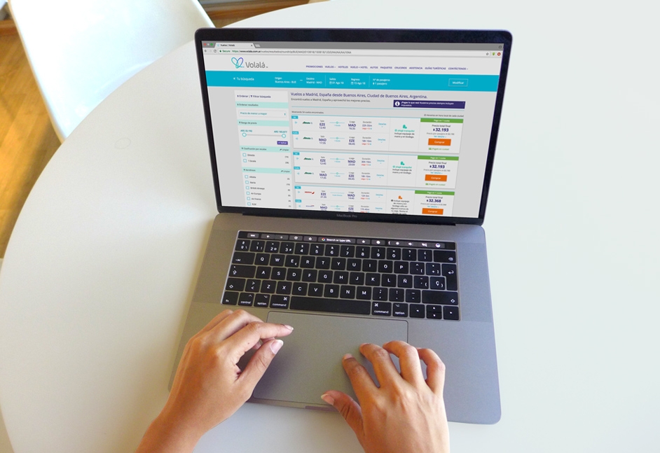
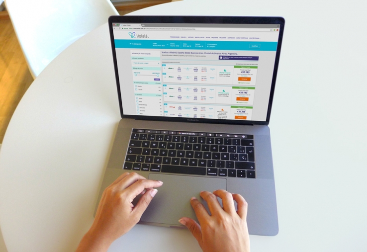
Volalá, one of the fastest growing OTAs (Online Travel Agency) in Argentina, is well aware of how essential it is for their business to optimize the usability and performance of their site. With this goal in mind, we designed a series of studies to identify the “pain points” that users experience when interacting with their website –both on PCs and on mobile devices. We also sought to discover opportunities to offer an excellent experience throughout the Customer Journey and maximize purchase conversions.
Usability problems are responsible for thousands of dollars in lost sales for e-commerce sites.

We invited frequent leisure and business travelers between 20 and 45 years-old to show us how they go about doing the usual tasks when buying tickets online: selecting destinations, dates and passengers, filtering the results and paying. The tests were carried out using computers and smartphones, in order to analyze the Desktop and Mobile versions of the website separately.
One of the main goals of the study was to evaluate the purchase process. Participants were asked to use different payment methods and to finance their purchases in multiple installments, which is a key part of the business in the Argentinian market. This allowed us to uncover those aspects of the interface that were roadblocks preventing users from completing the purchase, and to understand clearly how people assimilate and interpret the payment options that are presented to them on the screen.


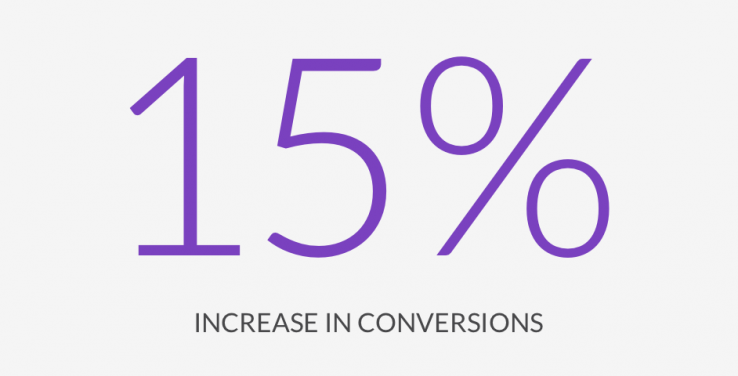
Few weeks after implementing the recommendations to improve the checkout process, Volalá had a 15% increase in conversions.
Confusion between interest-free and with-interest financing options appeared among the most relevant findings. This strongly impacts trust and the probability of recommending the service to other people. Another highlight was related to a recurring problem of almost all e-commerce sites: the excessive amount of personal data that must be completed –some information more than once– in the checkout forms.

The final report presented the study results categorized by their level of severity and recommendations for the Product and Development teams so that they could focus on implementing the fixes that would reap the greatest benefits.
Few weeks after implementing the recommendations to improve the checkout process, Volalá had a 15% increase in conversions.
Would you like to know more about our projects and services?
Contact us A Fintech start-up with social conscience, to realize the promise of greater community well-being and development
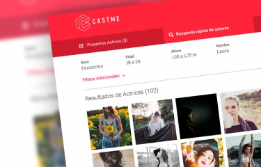
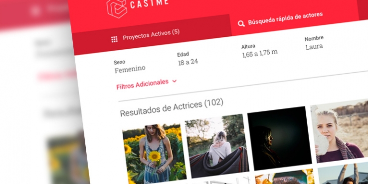
Transforming the casting experience with a disruptive platform.
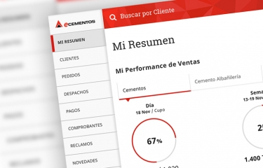
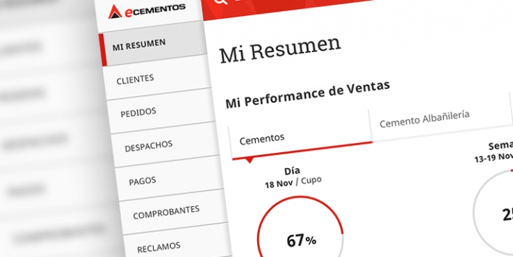
eCementos, web portal for customers and sales force for Cementos Avellaneda (Argentina) and Cementos Artigas (Uruguay).
Licencia Creative Commons - Atribución – No Comercial – Sin Obra Derivada 4.0 Internacional